A conceptual beauty brand inspired by Portuguese morning rituals, where branding, product design, and packaging come together to create a cohesive and sustainable brand experience.
Role

brand strategist / product designer / graphic designer
Timeline

January '26 - February '26
Team

1 designer

Bom Dia Cosmetics is a conceptual beauty brand inspired by Portuguese morning rituals and traditional craftsmanship.
Built around the slogan "The best mornings start in the shower", the project explores how branding, product design, packaging, and visual communication can work together to create a cohesive brand experience.
Rather than treating sustainability as the brand's primary message, the concept focuses on transforming an everyday routine into a small moment of care, simplicity, and reflection. Inspired by the geometry of traditional Portuguese azulejos, a single visual idea became the foundation for the entire brand system, shaping everything from the identity and packaging to the products themselves.
How might a beauty brand transform an everyday routine into a meaningful experience while maintaining a strong commitment to sustainability?
The beauty industry is crowded with brands competing through similar aesthetics, messaging, and sustainability claims.
Many eco-conscious products rely heavily on communicating their environmental benefits, often making sustainability the product's entire identity. While important, this can make it difficult to create a memorable brand that stands for something more.
The challenge was to create a sustainable beauty brand that felt distinctive and emotionally engaging without relying solely on sustainability as its defining characteristic.
The project began with a simple idea.
The name Bom Dia, meaning "Good Morning" in Portuguese, became the foundation for the entire concept. I wanted to create a brand that celebrated the quiet moments at the beginning of the day and turned a daily shower into a small ritual rather than just another task.
This direction shifted the focus away from products and towards the experience surrounding them.
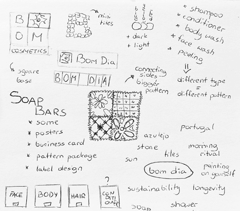
Sketching and defining the brand
At the same time, I wanted the brand to feel connected to Portugal without relying on stereotypical imagery or obvious cultural references.
During research, I became interested in azulejos, the decorative ceramic tiles found throughout Portugal. Beyond their visual appearance, I was drawn to the way they combine beauty, craftsmanship, repetition, and everyday functionality.
Rather than treating azulejos as decoration, I explored how their geometry and structure could become the foundation of the entire brand system.
This decision became the central idea that connected every stage of the project.

Tiles in Pena / my picture
The visual identity was built around the forms and patterns found in traditional Portuguese tiles.
The logo combines geometric shapes inspired by azulejos with a contemporary beauty aesthetic, creating a visual identity that feels both modern and rooted in its cultural inspiration.
Alongside the primary logo, I developed a secondary brand mark featuring a stylised sun surrounded by circular water patterns. The symbol references both the beginning of a new day and the cleansing nature of the products, becoming a recurring element across the wider brand system.
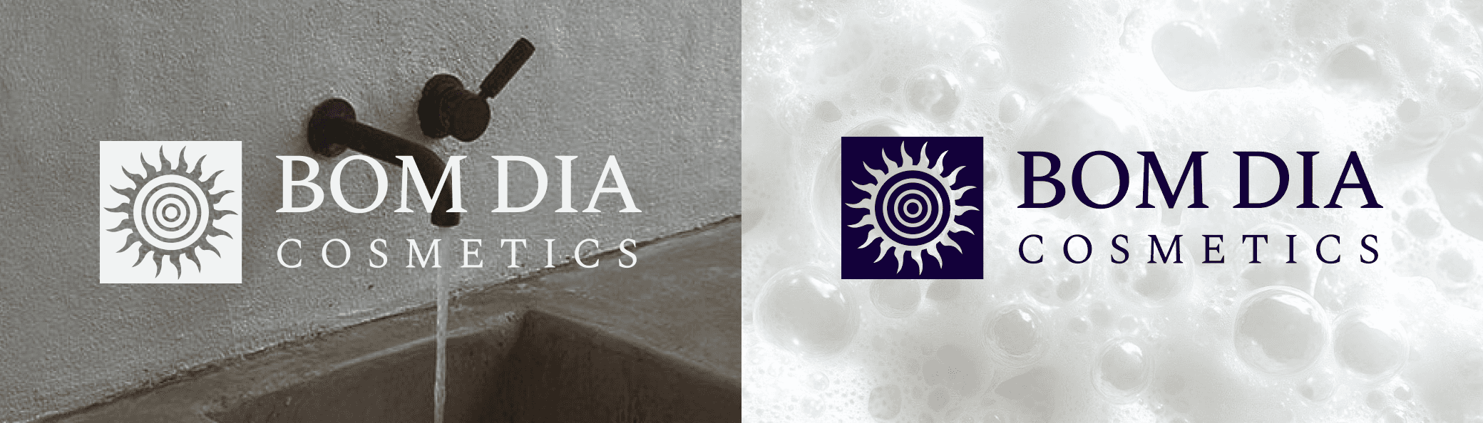
Logo design
The colour palette draws inspiration from traditional blue-and-white Portuguese tiles, helping establish a calm and recognisable visual language. Combined with clean typography and generous spacing, the identity balances simplicity with a playful sense of character.

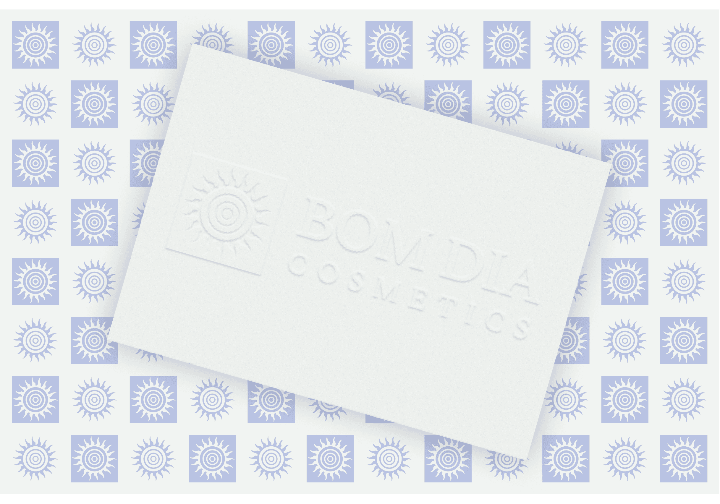
Visual system example
To ensure consistency across future applications, I developed a brand board outlining the logo system, typography, colour palette, graphic elements, and visual principles.

Once the visual identity was established, I explored how the same design principles could influence the products themselves.
Rather than designing conventional soap bars, I developed a square format inspired by the proportions of traditional azulejos. This allowed the products to become a physical extension of the brand identity rather than a separate element.

Soap product design
Different soap variants were designed to work both individually and collectively. When placed together, the soaps form larger visual compositions inspired by tile arrangements, reinforcing the connection to Portuguese craftsmanship and creating a recognisable product system.
By carrying the concept into the products themselves, the brand story became something users could physically interact with rather than simply observe.

Soap composition / poster Design
Sustainability was approached as a design principle rather than a marketing message.
The packaging system combines biodegradable paper wrapping for everyday use with reusable aluminium tins designed for long-term storage.
Inspired by azulejo geometry, the tins feature perforated patterns that provide both visual character and practical ventilation during storage and transport.
The packaging was also designed to support the product beyond the point of purchase. By placing the lid beneath the container, users can create a simple drainage solution that helps the soap dry properly and extends its lifespan.

Soap package design
Throughout the process, every packaging element followed the same visual language established by the identity, creating consistency across products, materials, and touchpoints.

Final product / poster design
To explore how the identity would perform beyond packaging, I expanded the project into a wider range of brand applications.
Posters, promotional materials, and supporting visual assets were developed to communicate the brand's personality and values across different formats.

Poster design examples
Business card design
These applications helped test the flexibility of the visual system while demonstrating how the identity could scale beyond the products themselves.
By applying the same graphic language, colour palette, typography, and tone of voice throughout every touchpoint, the project evolved from a collection of design assets into a believable and cohesive brand experience.

Bom Dia Cosmetics became an exploration of how a single idea can shape an entire brand experience.
By allowing one cultural reference point to influence branding, product design, packaging, and communication, the project demonstrates how different disciplines can work together to tell a consistent story.
One of the biggest lessons was recognising the value of restraint. Rather than continuously adding new ideas, the strongest outcomes came from developing one concept deeply and allowing it to guide decisions throughout the process.
The project also reinforced my interest in creating brands that extend beyond visual identity alone. Some of the most rewarding moments came from designing the connections between products, packaging, materials, and communication, and seeing how they could support one another within a larger system.
Looking back, Bom Dia Cosmetics remains one of my favourite projects because it combines storytelling, branding, product design, and visual communication into a single cohesive experience.